|
|
Post by wisejester7 on Dec 13, 2006 8:13:57 GMT -5
|
|
|
|
Post by GoodOldDreams on Dec 13, 2006 13:36:40 GMT -5
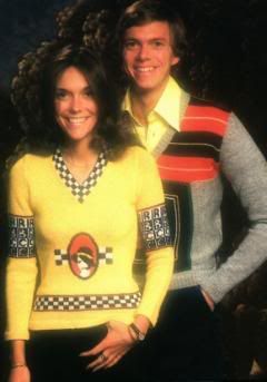
Thanks for the links wj7. Yikes! Is polyester really back nowadays? Looking angry when not smiling? Richard looking Asian and Karen looking like she has an allergy? I don't think scowling would be a solution either. This audio is very entertaining and informative telling like it was from Richard's perspective. I think it would be tricky to market any brother-sister act. Look at Donny and Marie — trying to be a little bit country and a little bit rock and roll to roughen up the edges of the Pepsodent kids-nextdoor squeaky wholesomeness, but they seemed to have a sense of humor about it. |
|
|
|
Post by Rick Henry on Dec 13, 2006 15:12:42 GMT -5
I think it would be tricky to market any brother-sister act. Look at Donny and Marie — trying to be a little bit country and a little bit rock and roll to roughen up the edges of the Pepsodent kids-nextdoor squeaky wholesomeness, but they seemed to have a sense of humor about it. It does seem a bit tricky to market a brother and sister act. Though Carpenters, unlike Donny and Marie, were musically a first rate act and Karen Carpenter is one of the world's greatest vocalists ever.
Donny and Marie's music fit their kitch-like image. Carpenters' music was so much more deep and elegant, I feel that A&M could have done a better job at portraying them as the intense musicians they really were.
Someone had once mentioned that a cover similar to Burt Bacharach's "Reach Out" cover would have been a great idea for K&R.
Richard complains about Carpenters' album covers - but for the most part I think the bulk of their covers were pretty good. I'd say "A Kind Of Hush", "Made In America" and "Voice Of The Heart" are the covers that did the most image damage (in the eyes of the general public - not to Carpenters fans) - and those came well into their career. I was working in a record store when "Voice Of The Heart" was released and it saddened me to hear the many rude comments made about that album cover. I remember when it came in I displayed it in one of the front racks so people would be able to see it. But one of the other employees (a supervisor) moved it to a display in the back of the store commenting "we don't want to scare our customers away".
"Horizon" and "Now And Then" were probably their best covers image-wise. The non picture covers like "Carpenters", "Singles 1969-1973" and "Passage" were great covers also.
Though, I love the album I never really cared for the cover of "Christmas Portrait" nor "An Old Fashioned Christmas" at that. Yes, they were professionally done - but for a group trying to get away from the kitchy image - these covers only made them look more kitchy and almost cartoon like.  |
|
|
|
Post by GoodOldDreams on Dec 13, 2006 18:17:47 GMT -5
I think it would be tricky to market any brother-sister act. Look at Donny and Marie — trying to be a little bit country and a little bit rock and roll to roughen up the edges of the Pepsodent kids-nextdoor squeaky wholesomeness, but they seemed to have a sense of humor about it. It does seem a bit tricky to market a brother and sister act. Though Carpenters, unlike Donny and Marie, were musically a first rate act and Karen Carpenter is one of the world's greatest vocalists ever.
Donny and Marie's music fit their kitch-like image. Carpenters' music was so much more deep and elegant, I feel that A&M could have done a better job at portraying them as the intense musicians they really were.
Someone had once mentioned that a cover similar to Burt Bacharach's "Reach Out" cover would have been a great idea for K&R.
Richard complains about Carpenters' album covers - but for the most part I think the bulk of their covers were pretty good. I'd say "A Kind Of Hush", "Made In America" and "Voice Of The Heart" are the covers that did the most image damage (in the eyes of the general public - not to Carpenters fans) - and those came well into their career. I was working in a record store when "Voice Of The Heart" was released and it saddened me to hear the many rude comments made about that album cover. I remember when it came in I displayed it in one of the front racks so people would be able to see it. But one of the other employees (a supervisor) moved it to a display in the back of the store commenting "we don't want to scare our customers away".
"Horizon" and "Now And Then" were probably their best covers image-wise. The non picture covers like "Carpenters", "Singles 1969-1973" and "Passage" were great covers also.
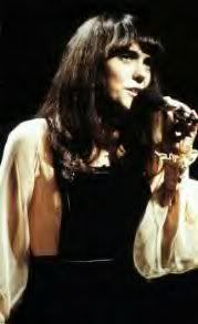
Though, I love the album I never really cared for the cover of "Christmas Portrait" nor "An Old Fashioned Christmas" at that. Yes, they were professionally done - but for a group trying to get away from the kitchy image - these covers only made them look more kitchy and almost cartoon like. The Carpenters were all about their music and not their image, which was more of a second thought. I agree that the caliber of the Carpenters' music is magnitudes higher than that of Donny and Marie's, and should have been promoted accordingly. As Richard had commented, the powers that be did not really spend the time or effort to figure how to promote them effectively. A couple of siblings from suburbia simply does not have the innate slick and edge of having come from the streets of big cities. Especially in the relatively repressed American culture, there a certain prejudicial "ick" factor attributed to a brother-sister act that goes way beyond even a family act (Cowsills, Partridge family), brother-brother act (Jackson Five, Osmonds, Bee Gees), sister-sister act (Mandrell Sisters) and mother-daughter act (The Judds). In some people's minds, Richard and Karen were mistakenly perceived as a married couple rather than a sister-brother act, as if there were taboos against brothers and sisters getting along with each other, let alone working together. It would be difficult to overcome this kind of social bias. The album covers for "Christmas Portrait" and "An Old-Fashioned Christmas" were stylistically patterned after the Saturday Evening Post magazine covers from around 1916–63 by Norman Rockwell, who was known for his nostalgic paintings of idealized, wholesome images of American life, often embellished with mischievous kids, awkward youths and adults for humor in the context of an "innocent" bygone era. Conceptually these paintings fit in well with the theme of the music and titles, but they may have only reinforced the goody four-shoes image that Karen and Richard tried to elude. For me personally, "Voice of the Heart" is one of my favorite album covers. Here Karen and Richard are presented as individuals, not in the usual smiling cheek-to-cheek pose with each other (not that there is necessarily anything wrong with that). In their respective masterfully lit photos, Karen and Richard are looking directly at the viewer, their eyes truly windows to their souls and each seeming to be speaking with a voice straight from the heart. In perhaps a rare moment of self-confidence about her image, Karen remarked to her friend Karen "Itchy" Ramone how beautiful she felt after looking at the pictures from this (or a similar solo) photo session. In Richard's photo on the back cover, his expression, the way the lines of the piano strings converge, and his thoughtful words in tribute to Karen all contribute to a moving and powerful visual moment frozen in time. In their unique ways, these have to be among the most beautiful, elegant and classy images of them anywhere, anytime.   |
|
|
|
Post by wisejester7 on Dec 13, 2006 22:47:57 GMT -5
It does seem a bit tricky to market a brother and sister act. Though Carpenters, unlike Donny and Marie, were musically a first rate act and Karen Carpenter is one of the world's greatest vocalists ever.
Donny and Marie's music fit their kitch-like image. Carpenters' music was so much more deep and elegant, I feel that A&M could have done a better job at portraying them as the intense musicians they really were.
Someone had once mentioned that a cover similar to Burt Bacharach's "Reach Out" cover would have been a great idea for K&R.
Richard complains about Carpenters' album covers - but for the most part I think the bulk of their covers were pretty good. I'd say "A Kind Of Hush", "Made In America" and "Voice Of The Heart" are the covers that did the most image damage (in the eyes of the general public - not to Carpenters fans) - and those came well into their career. I was working in a record store when "Voice Of The Heart" was released and it saddened me to hear the many rude comments made about that album cover. I remember when it came in I displayed it in one of the front racks so people would be able to see it. But one of the other employees (a supervisor) moved it to a display in the back of the store commenting "we don't want to scare our customers away".
"Horizon" and "Now And Then" were probably their best covers image-wise. The non picture covers like "Carpenters", "Singles 1969-1973" and "Passage" were great covers also.
Though, I love the album I never really cared for the cover of "Christmas Portrait" nor "An Old Fashioned Christmas" at that. Yes, they were professionally done - but for a group trying to get away from the kitchy image - these covers only made them look more kitchy and almost cartoon like. The Carpenters were all about their music and not their image, which was more of a second thought. I agree that the caliber of the Carpenters' music is magnitudes higher than that of Donny and Marie's, and should have been promoted accordingly. As Richard had commented, the powers that be did not really spend the time or effort to figure how to promote them effectively. A couple of siblings from suburbia simply does not have the innate edge of having come from the streets of big cities. Especially in the relatively repressed American culture, there a certain prejudicial "ick" factor attributed to a brother-sister act that goes way beyond even a family act (Cowsills, Partridge family), brother-brother act (Jackson Five, Osmonds, Bee Gees), sister-sister act (Mandrell Sisters) and mother-daughter act (The Judds). In some people's minds, Richard and Karen were mistakenly perceived as a married couple rather than a sister-brother act, as if there were taboos against brothers and sisters getting along with each other, let alone working together. It would be difficult to overcome this kind of social bias. The album covers for "Christmas Portrait" and "An Old-Fashioned Christmas" were stylistically patterned after the Saturday Evening Post magazine covers from around 1916–63 by Norman Rockwell, who was known for his nostalgic paintings of idealized, wholesome images of American life, often embellished with mischievous kids, awkward youths and adults for humor in the context of an "innocent" bygone era. Conceptually these paintings fit in well with the theme of the music and titles, but they may have only reinforced the goody four-shoes image that Karen and Richard tried to elude. For me personally, "Voice of the Heart" is one of my favorite album covers. Here Karen and Richard are presented as individuals, not in the usual smiling cheek-to-cheek pose with each other (not that there is necessarily anything wrong with that). In their respective masterfully lit photos, Karen and Richard are looking directly at the viewer, their eyes truly windows to their souls and each seeming to be speaking with a voice straight from the heart. In perhaps a rare moment of self-confidence about her image, Karen remarked to her friend Karen "Itchy" Ramone how beautiful she felt after looking at the pictures from this (or a similar solo) photo session. In Richard's photo on the back cover, his expression, the way the lines of the piano strings converge, and his thoughtful words in tribute to Karen all contribute to a moving and powerful visual moment frozen in time. In their unique ways, these have to be among the most beautiful images of them anywhere, anytime. GoodOldDreams ... It's always so very visually pleasing to 'talk' with you. Thanks for the pics of Karen and Richard. |
|
|
|
Post by Rick Henry on Dec 14, 2006 2:05:03 GMT -5
Several good points made GoodOldDreams. Please remember, though, my comments on the covers of AKOH, MIA and VOTH are more of a viewpoint from the person who is not into Carpenters or is maybe a casual listener. Of course the die-hard fans love these album covers. Some we love more than others - but for the most part we love them all.
I had started working in the music store shortly after "Made In America" was released and I remember hearing more than a few jokes made about that album cover. I know Carpenters fans don't like hearing comments like this (or like the one on my co-worker comments about the VOTH cover) but I'm just reporting from what I witnessed first hand. This is history as it happened - and this is a view of how Carpenters were perceived by the general public. Of course we knew better - and we also knew back then how Richard felt about the way they were being promoted.
Speaking of favorite album covers I'd say mine are "Horizon", "Now And Then" and "Passage". "Passage" is a fantastic artful cover. Secondary favorites are "The Singles 1969-1973", "Close To You", "Ticket To Ride" and the original "Offering" cover. |
|
|
|
Post by GoodOldDreams on Dec 14, 2006 2:46:17 GMT -5
I realize that for sure. I also think your former supervisor may be saying, as an alternative interpretation of the meaning of that snide remark, that having a bigger-than-life size image of a singer who recently passed away on an album cover may scare people away. As Richard expressed in the audio link, he was was understandably not fond of the "Now and Then" or "Close to You" covers, but like you, I personally like them anyhow. With the management offering no effective plans to market them visually, I now understand why there are so many albums with no prominent images of them on the cover, such as the self-titled "Carpenters", "A Song for You" and "Passage" albums and many of the compilations. |
|
|
|
Post by Rick Henry on Dec 14, 2006 2:59:40 GMT -5
I realize that for sure. I also think your former supervisor may be saying, as an alternative interpretation of the meaning of that snide remark, that having a bigger-than-life size image of a singer who recently passed away on an album cover may scare people away. I see your point there on that one Dreams. Although, Sher (supervisor's name) disliked the Carpenters terribly and she felt displaying any Carpenters album was bad for business as she always said they were too "goofy" looking. And as you said a bigger-than-life-size image of a singer who just died most likely did not help matters. She also disliked Crystal Gayle - and I would play both Crystal and Carpenters in the music store on a regular basis - she always had a fit - others just simply tolerated it - they weren't neccessarily happy about it - but would tolerate me playing C's and Crystal.
Now, on the other hand "An Old Fashioned Christmas" was well liked - I played that in the store during Christmas 1984 and nobody complained - they actually made positive comments about the album.
I held onto that part-time job for several years - simply because I enjoyed being in the music atmosphere and I would get several free promo albums on a regular basis. My main job was my own business - I have always had my own business - back then I used to sell import records through mail order - and working in the music store helped me keep up on all the latest groups from England, Japan and other parts of the world. As Richard expressed in the audio link, he was was understandably not fond of the "Now and Then" or "Close to You" covers, but like you, I personally like them anyhow. I've heard that one before and I don't understand why Richard did not like the "Now and Then" cover - I guess he said it was something to do with the airbrushing. I always felt N&T was one of their very best covers and also one good for their image. The shot of K&R in this flawless sports car was not only "cool" but also "hip" - and caught the eye of many male record buyers.
"Close To You" I like mainly because Richard said he didn't like it. I think it's a great shot of K&R - and I don't think it made them look like husband and wife at all. Again they were fashionably clothed and the background was alluring. Great photo!
|
|
|
|
Post by Prisoner_Walking on Dec 14, 2006 6:13:43 GMT -5
Some very good points you've made regarding the Carpenters album covers here guys.
I have to admit that when I first saw "Voice Of The Heart" cover (before I was a die-hard fan) I did wonder why they'd used a picture of Karen appearing to be emaciated (frankly). But (I don't know whether any of you have experienced this) over the years several of my friends who are non-fans have seen pictures/videos of Karen from BEFORE she developed anorexia and made remarks like "God, she looked so awful there...so skinny". Is this an unfortunate result of Karen being widely associated with her illness? Or would people have made these comments regardless?
I personally think that Karen's beauty was and is underrated. Richard was a handsome guy too! I just think that looking at it from a 2006 perspective, their hair and clothes did not do them any favors!
Karen looked at her most beautiful around the time of "Mr. Postman", indeed at the time of the "Horizon" cover. Her hair was long and slightly wavey...the most flattering look for her face. I believe that she was never meant to have a fringe (or 'bangs' as you call it in the States), and that early 80's short perm was a disaster!
But it WAS the 80’s and many stars from that time who are still famous now, like Karen and Rich, probably look back and say “what was I THINKING?” Had Karen lived, we can only speculate that they would have overcome the ‘goofy’ image problems and carved a more fitting look.
|
|
|
|
Post by enigma on Dec 14, 2006 12:48:32 GMT -5
I've heard that one before and I don't understand why Richard did not like the "Now and Then" cover - I guess he said it was something to do with the airbrushing. I always felt N&T was one of their very best covers and also one good for their image. The shot of K&R in this flawless sports car was not only "cool" but also "hip" - and caught the eye of many male record buyers.
"Close To You" I like mainly because Richard said he didn't like it. I think it's a great shot of K&R - and I don't think it made them look like husband and wife at all. Again they were fashionably clothed and the background was alluring. Great photo!
I never knew that the Now and Then Cover was airbrusheed I heard the VOTH one was but not N&T. Anyhow I do understand Richards beef with the N&T cover I agree that covering Karens face was not the best idea she was the main selling point for the duo no offense to Richard and should not have been covered I mean you could barely see her and she was what was selling the records I have never seen a group/artist/duo/etc cover where one was covered up you have to look hard to see Karen in this photo so I must agree with Richards criticism here. Other than that the cover is one of their better ones. Also with regards to the covers another of Richards points was that the covers contributed to the image and I also agree with that CTY AKOH and ASFY may have been nice covers but they rienforced the unhip lovey dovey image and did more damage than good. Thats why when I saw the Horizon cover for the first time I was a little taken back and impressed at the same time. It was against their image which was a risk at the time yet refreshing for the same reason. FYY other favorite covers of mine are Offering (believe it or not) N&T, and Passage. With regards to the music selling the Carpenters to us fans that may be true but in reality great care was taken to market the Carpenters image and like it or hate it it did factor in the attention they got and it did sell them records believe it or not.   |
|
|
|
Post by YesterdayOnceMore on Dec 14, 2006 13:43:37 GMT -5
 Man - I've never really given this a lot of thought until now. Always did like the Now and Then cover - loved the idea of the Song for You cover, even though it was just a heart on the cover. The Now and Then cover was never a fave, exactly - I did like the pictures on the inside of both Karen and Rich - and I liked the fact that the Newville house was in the background on the front cover - but never really thought much about the fact that Karen and Richard ARE both quite hard to see in the photo, while in the car.....I just figured that those who knew anything about them knew Richard loved cars, and this was a connection - one of his cars, and the home they lived in....sort of a "private" moment, if you will. I may be one of the few, but I LIKE Karen's look on the Voice of the Heart LP. I believe a lot of care was undoubtedly taken to make her look her absolute best. Yes, she does look thin, but I've seen many worse pictures of her than this one. In fact, this one is a great one....and I believe the story goes she wanted this one used on her solo CD - but Richard chose to use it for the VOTH cover, hence, the renderings on the solo CD. I like Karen's photo on VOTH, and I like Richard's quite sad looking photo on the back. I just thought it made sense that he would put Karen on the front by herself, considering the fact that she WAS gone. But, a big part of me thinks that the reason the album came out as it did, is because people wanted more (anything) of what Karen had done. I thought it was quite smart, and I felt appreciative, somehow, that Karen, alone, was on the front cover of this particular album, as it was sort of a "tribute" to her, in my eyes. Interesting conversation going on here. Always learning something new.  Tim 
|
|
|
|
Post by Rick Henry on Dec 14, 2006 23:52:54 GMT -5
Since others have touched on the VOTH cover - the thing I don't like about it - is Karen just looks too sad and stressed out. It is a beautifully photographed picture but it's just not one of my favorites. As far as that picture possibly being used for the cover for Karen's solo - I don't think that is true - as the cover which is on Karen's solo is the cover which was intended for it if it was released in 1980.
On the N&T cover the fact that you really couldn't see Karen's (or Richard's) face in my mind is not a hinderance. I have seen other album covers where the faces of the performers are obscured in one way or another - and that only adds to the mystique and in some cases the artistry of it. I found N&T to be a fantastic cover as it really was a "good for the image" cover. The pictures of K&R on the inside - oddly - I did not like - they looked somewhat plastic - sorry people for saying it that way.
I agree Enigma that the image thing was carefully marketed - but beyond all the care and time - I still feel Carpenters should have been marketed differently. Yes, they sold tons of records - but I can't help to think that may have sold much more if they were marketed more like James Taylor or even John Denver - not so cutesy - but more low-key down to earth. I think the reason Carpenters sold so many records is because of the fantastic music and people looked beyond the goody two shoes image that A&M carved out for them - anyway up until AKOH.
Like you Enigma - I'm not quite sure why I like the original "offering" cover so much. I guess maybe it's the big sunflower or it could be those groovy late 60's fashions. |
|
gwen
NEW TO THE FAMILY
 Karen fans will really love Angelspit, Snake River Conspiracy, Diva Destruction etc.
Posts: 13
|
Post by gwen on Aug 12, 2011 13:55:19 GMT -5
you know, Horizon is a really great CD, one of their best but of course every Carpenters CD is the best. I dont think I can ever choose which is the best one but I always did hate that album cover! It looks like they just came out of the woods but they werent expecting that a camera crew was going to be there to catch them when they were walking back to their cars. They were doing something they shouldnt have been if you know what I mean? Its the only explaination for those wierd looks on their faces. That album cover has always looked real creepy to me. Thats just my viewpoint. Im sure that most people probably dont see it that way but it just looks so peculiar.
|
|